This afternoon has been really useful in prep for screen print and also commercial print...AND confusing.
For print it's all about creating layers and positives. Split up into channels CMYK...Cyan, magenta, black and yellow. This seemed most applicable for photos though.
Process Colours.
Spot Colours - In commercial printing it can be cheaper to use ( if you only have a couple of colours). Corporate logos all have spot colour references. By double clicking on SWATCH in illustrator you can change it to process or spot colour. For screen printing change it to Spot colour.
For these positives for screenprint, you print them off black and white 1. Output 2. Mode - Seperations (HB). Name the positives so you know when you go to screen-print (in photoshop these come up if you select labels and crop marks).
INDESIGN> Choose process or spot. Pantone folder.
PHOTOSHOP> Image - mode - Pantone solid coated. Go to print...colour handling...serperations options there.
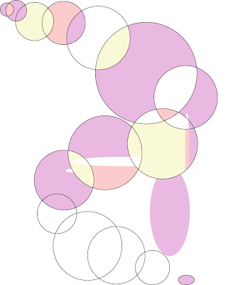
This is an image to test the seperations and print them to show what to print.
Here are the Seperations which are printed out...


I practiced with a photo which i shall hopefully print, or possibly use somebodies photography in the photography group. In order to produce these separations your image must be in the CMYK mode.

No comments:
Post a Comment