

CYAN.

MAGENTA.

YELLOW.

BLACK.

The finished image looks like this...

It was interesting to play around with different combinations, and was amazing to see how different just one of these colours can make an image look. Especially the Yellow to Magenta! The image seems to suddenly appear...


As I was printing and because of the nature of the image, I played a little with the positioning of each colour seperation. It gives the image a more 3d and stylistic feel...It's amazing how, by just moving the next print the tiniest, tiniest bit it changes the image completely!


I also tried printing the black onto my own made paper and it came out really really nice!

Although screenprinting an image can feel as though you don't have much control over how it looks, through doing it, I've found that you really can. Through moving the position of print on top you can adjust how the original image would look. Also the pressure you put on the squeegee makes all the difference... and where you put most pressure, then tells where the ink comes out thickest and where. Going over the print more times than one can make a layer of the photo look thicker and a fuller colour.
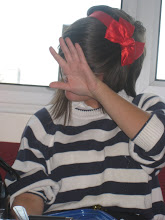
FOR COMPARISON...THE ORIGINAL....


No comments:
Post a Comment