Showing posts with label Com Tech 2.. Show all posts

Tuesday, 24 November 2009

Cutting Out... Collage... Colours and Bit's and Bobs.


These are a few bit's that I tried to adapt looking at Clare Coles work and other paper and collage artists. I think with more time I could produce something much better and this is what I plan to do, but for now I like the fabrics and foil mixed. I wish I could have used more stitch, but with a broken sewing machine and tired hands I only got the chance to do tiny bit of stitch.

Cutting and over laying acetate that I had also worked well, giving the papers depth. I felt that after I had drawn on top and added stuff that they felt more personal, from feedback I got from others they felt this too.


Picking what colour foil I wanted for the mirror image was also a hard decision. Above is the Gold and below, the Platinum. It was important as I didnt want it to be too shiny and bright, but also not to dull, I wanted to see it was foils.


This is my design that didnt come out properly and you couldnt see, Im pleased that I did it on different coloured card, as I think that the colours complement each other beautifully.

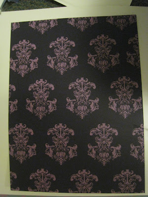
This one doesnt work as well, but it still made a nice image.

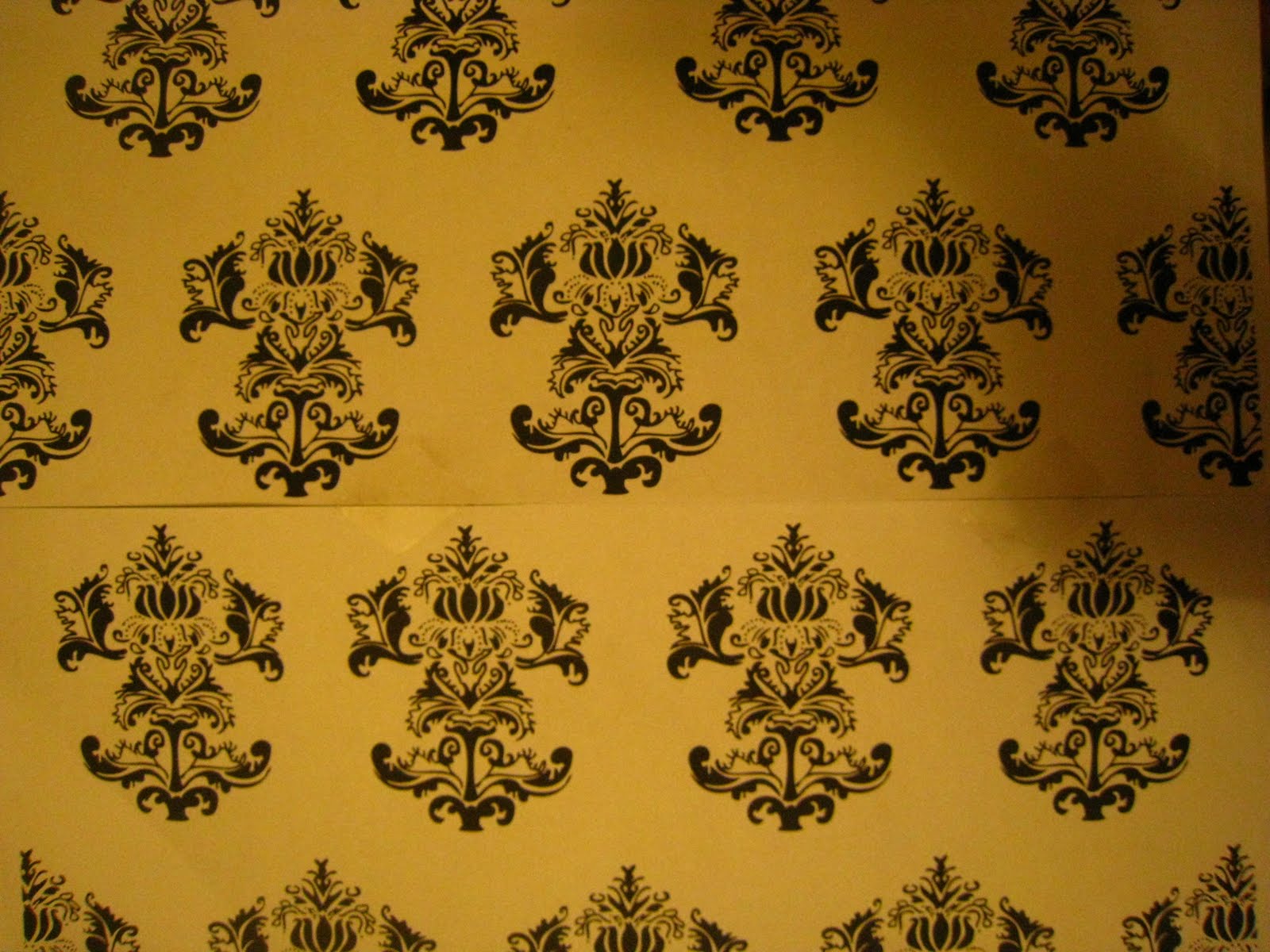
Here are some prints of one of my wallpapers on different coloured paper...it gives it a different dynamic to the others that are on creamy paper. Its a shame that I couldn't get a long enough strip to do some of the others with a different coloured backgrounds.


Some print on my handmade paper, the texture and the way the paper rests makes the screenprinted image on top look very quitch and organic.


Paper Craft.

This is something I was hoping to try out from papers that I had printed onto, it was to go with my idea of interactive wallpapers but I hope to try out some sort of oragami in the future.


Monday, 23 November 2009

Coming to an End...

Well as I come to the end of this project I feel that it had been a major turn in how I will now work and what projects I intend to do in the future. 
Here are my final wallpapers... although the photos are pretty shit!...

No.1 - 


Cutting out of the wallpaper, gave it a 3D dynamic, although I didnt get as much of it done, I hope to do it on a bigger scale some day.
I think as a wallpaper it's sucessful, however It needed some colour, which I wanted to collage in with materials, but ran out of time. I am lucky that the colour of the paper was an off white, I think It compliments all the papers I made.

No.2 -


(This is the read flock I would have had to use :/ )
I was tearing my hair out nearing the end of this paper, I went to flock and they didnt have the colour that I needed/wanted for the frame structure. Initially I wanted it to be a dark red that I used in my previous flocking experiment, although the royal blue doesn't look as bad as I thought. I tried out some bright red on a different mock up I had but it was too intense. Some of the flock glue smudged aswell, which meant that the flock picked up everywhere, as you can see in the last image. 

No.3 -


I was upset that you could see the creases especially well in this paper, it was creased from the heat press. It was such a struggle trying to flock and foil with long strips of wallpaper, as you have to cover the top of the stuff you are flocking or foiling with newsprint, however I had bits of glue all down the page for the other mirrors. This meant that when the newsprint went over it, it would stick and be stuck to the actual image. I learnt that on my mock one, therefore I had to make sure the other mirror was not under the heat, causing to heat press a massive crease in the paper. Over all I am pleased with this paper, it is quaint, which is what I was going for.


No.4 -


The overall paper I am not so pleased with as the pink design doesnt show up enough. However it was a feat because I managed to sucessfully dye the paper pink. I wish the design picked up more. When doing this again I will think about colours more as all the designs are quite dull and don't truely reflect any Fashion Eras.

No.5 - 


This was done kind of last minute, but I really like the colours I used in this and number 6. When printing it I didnt seperate the roses from the stripes so It was a massive effort to tape over the roses with tape that was much wider than that! It took ages but eventually was done, however there were a few leeks from bubbles in the tape.


No.6 - 


Tuesday, 17 November 2009

Another Problem...


I started printing the dots for my flock wallpaper today but almost ended up leaving because everything seemed to go wrong.
The first problem was that the image of the dots I had put on the screen was missing one row of dots meaning that when I print onto my lining paper I have to overlap the dots perfectly or I will have to draw in a line of dots by hand! 


(Although up-close it looks like a small difference in the dots...when looked at from the correct viewing distance it looks very WRONG). 


The alignment of some of my other designs was wrong as well even though I had spent ages checking them on illustrator and making them pretty perfect. Neil told me that illustrator is really un-reliable and prints differently on each bit of paper to what it may seem.
Here are two other designs which Neil helped me to piece together perfectly, measuring and cutting out a gap, so as to make it join perfectly....


Here you can see my final image (which was two seperate A3 papers) on my screen. Being one image also made it easier to print and there was less faffing around trying to line things up.


How wallpaper designers actually put their ideas to paper and hand-print them is something that I want to look into further during this last week as I have had so many problems!