
'The individual metal characters to impress a letter on the page'.
Letterpress printing depends on a raised image, it’s known as a relief process. Movable type was the breakthrough that allowed printers to use and re-use individual characters. When you practice letterpress printing it’s easy to forget just how difficult it must be for type founders to create tiny pieces of cast metal hard enough to withstand a tremendous force that are made to tolerances of less than one thousandth of an inch.
Background
Gutenberg of Germany is credited with the invention of moveable type around 1450; but records show that both Chinese and Korean inventors had used the idea before the time. Gutenberg’s invention was the first to be exploited and the idea spread rapidly. There are three key stages in founding type –
- Punch cutting: creating a three-dimensional repres entation of the letter in the end of a bar of metal. This skilled work requires a number of other punches and tools to be used to create the punch, and then it be subject to hardening. Modern-day equivalents of punches can be seen in DIY stores to mark metal equipment with initials.
- Creating the Matrix: this step takes the punch, and strikes it in a softer metal to make a negative mould. The metal is usually brass
- Casting: this is filling the mould with molten type metal and removing the cast type
'Packing' ...
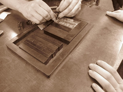


The text you put together, must be reversed in the bed so that it reads the right way when It's printed. However loading the bed, you still insert the letters from left to right, working upside down. It's a pretty tedious task, and takes a while to put together, so it's important to look for mistakes when you go to pack it! We found a few before we printed.
Another frustrating factor is that the length of your lines of text has to match the length of the leading exactly, so that it's packed well. Sometimes at the end of our line we had just the tiniest of gaps, it was so hard to find a piece to fit perfectly and pack it out, some gaps so tiny that we used a tiny bit of paper. If you over space a line, the others can move and this can cause it to print wonky.
These two images are on card, the first one is very crisp and clean-cut, this had more packing of paper behind the card actually being printed on. It was being pressed so hard that it emmbossed it a little bit and even made an interesting image on the back of the paper.

This is on card with less packing, a lighter less aggressive print.


This is onto newsprint, the tones of the paper and ink go really well, making it s a softer print, but also i did one which below this one with less packing to see the difference.


This is printed onto a thick tracing paper, I did it mor than a week ago and it's still not dry, the ink drys better on card and paper. not slippery surfaces.

Again, this is a slippery surface and so took while to dry. This is Acetate, which also enables me to put pattern or stuff behind it and preview it.


Lastly, I printed onto tissue paper with different pressures...


These are prints we did. I experimented with using different papers and using different thicknesses of backing for the paper i was printing on itself. Putting stuff through you pack it out, with tissue paper and thin card to make the print crisp and clear. However playing around with the paper you put behind it to support it changes the print completely. Inserting lots of card behind it even created this 'embossed' look...
This is a piece of card that i used as packing which was so tight through the rollers that it actually embossed it.

No comments:
Post a Comment