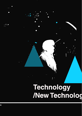
Before i created the following pieces from my drawings, i had never really tried using the program. Although these images arent really me, i did enjoy creating them, and almost a new style for me to work in sometimes perhaps?
I would live trace the images, manipulating the drawing i had done and turning them into an altogether different piece of work. From working with illustrator, you begin to understand that it tends to flatten images and what is fun is that it turns the whole image into their own little shapes.
The first two that i did below i think worked well as i used a strong photo, (they are from the lomography photos). It is so easy to change the colour of certain parts as well, and as long as you dont save your image as a jpeg then for work being commisioned or if someone likes something but they want it in a different colour, its easy to change the background or little bits. The first one was just blue and then i changed and selected different bits to be different colours.

This was Another lomography picture, the one with the stairs. I found this image much harder. As i said above, because this wasnt a strong photo i found it hard to make something out of it. Therefore i started with a shape, the triangle. Being so easy to duplicate and change the colour i played around with it and eventually came up with something i though was interesting. What was amazing about using illustrator was that it has swatches, they are all colours that are already picked for you, a couple of favourite swatches of mine are 'Russian Poster Art' and 'Textiles', the one below is using 'Basic Graphic Dots'. Below that is the first one i did, just using simple contrasting colours, also using the 'reflection' text technique which you can also apply.


No comments:
Post a Comment