Wednesday, 14 October 2009

Taking a step back..

I'm still busy exploring the different print techniques available in the print rooms, however I took time out this weekend to have fun going back to basics and experimenting with print techniques available to everyone in their own homes.

Potato Printing


Like the idiot I am, i forgot that i needed to reverse the type to get it forwards! (It was a long night) and so my print all came out backwards. I took some photos of them in a mirror, to see what the print style was like. It gave me the idea of possibly doing a piece of work that is purposely backwards though!


From doing lino and mono-print at some stage and being aware of how wood-cut works, we can see using the potato as just an everyday object lying about the home that can be used in the same way but that will perish. In the same way that lino and wood-cut work, using a potato is still building or taking away bits of a surface to imprint an image. Although this way of working does feel quite childish, as does finger painting, it is still a fun and creative way to put images together.

Finger Printing


Working in this way didnt feel like I was really trying to achieve anything. The finger print itself is an interesting image, but trying to make an image from fingerprints is less like a print technique.

Rubbings

Although this doesn't have the word print in it, I described printing earlier such as mono, potato and lino being an image, in which you build or take away bits of a surface to imprint an image...rubbings seemed to apply, closely relating to mono-print. This was a quick way of getting image and information from things around me. Some look good to draw from!... or good to create pattern from!

These are also, something described as print, by having a photocopy and rubbing nail varnish over the back the image is transferred to the paper beneath it...

Working in these ways almost feels like you print to FIND images?
I hope to add some other easy ways of printing around the house as my project develops.

Letterpress.


'The individual metal characters to impress a letter on the page'.

Letterpress printing depends on a raised image, it’s known as a relief process. Movable type was the break­through that allowed printers to use and re-use individual characters. When you practice letterpress printing it’s easy to forget just how difficult it must be for type founders to create tiny pieces of cast metal hard enough to withstand a tremendous force that are made to tolerances of less than one thousandth of an inch.

Background

Gutenberg of Germany is credited with the invention of moveable type around 1450; but records show that both Chinese and Korean inventors had used the idea before the time. Gutenberg’s invention was the first to be exploited and the idea spread rapidly. There are three key stages in founding type –

  • Punch cutting: creating a three-dimensional repres entation of the letter in the end of a bar of metal. This skilled work requires a number of other punches and tools to be used to create the punch, and then it be subject to hardening. Modern-day equivalents of punches can be seen in DIY stores to mark metal equipment with initials.
  • Creating the Matrix: this step takes the punch, and strikes it in a softer metal to make a negative mould. The metal is usually brass
  • Casting: this is filling the mould with molten type metal and removing the cast type
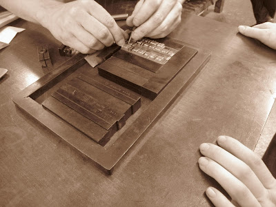
Here are some photos throughout the process...
'Packing' ...


The text you put together, must be reversed in the bed so that it reads the right way when It's printed. However loading the bed, you still insert the letters from left to right, working upside down. It's a pretty tedious task, and takes a while to put together, so it's important to look for mistakes when you go to pack it! We found a few before we printed.

Another frustrating factor is that the length of your lines of text has to match the length of the leading exactly, so that it's packed well. Sometimes at the end of our line we had just the tiniest of gaps, it was so hard to find a piece to fit perfectly and pack it out, some gaps so tiny that we used a tiny bit of paper. If you over space a line, the others can move and this can cause it to print wonky.

These two images are on card, the first one is very crisp and clean-cut, this had more packing of paper behind the card actually being printed on. It was being pressed so hard that it emmbossed it a little bit and even made an interesting image on the back of the paper.
This is on card with less packing, a lighter less aggressive print.

This is onto newsprint, the tones of the paper and ink go really well, making it s a softer print, but also i did one which below this one with less packing to see the difference.

This is printed onto a thick tracing paper, I did it mor than a week ago and it's still not dry, the ink drys better on card and paper. not slippery surfaces.

Again, this is a slippery surface and so took while to dry. This is Acetate, which also enables me to put pattern or stuff behind it and preview it.


Lastly, I printed onto tissue paper with different pressures...


These are prints we did. I experimented with using different papers and using different thicknesses of backing for the paper i was printing on itself. Putting stuff through you pack it out, with tissue paper and thin card to make the print crisp and clear. However playing around with the paper you put behind it to support it changes the print completely. Inserting lots of card behind it even created this 'embossed' look...

This is a piece of card that i used as packing which was so tight through the rollers that it actually embossed it.

Wallpaper Samples Have Arrived...

The past couple of weeks has been exciting as near enough every other day I've received wallpaper samples from companies I looked at over the internet. I've only put two companies up here, as they're are quite a few...

I ordered a couple of catelogues aswell to understand how much you can actually sell wallpaper for and how what materials and how you print can alter the cost...

FARROW&BALL
It was interesting to read the back of the wallpapers, here is where you can read what the design is, the colour, it's code, washibility. It also advises you on how to apply the paper, and how many rolls to buy. 

LONDON WALLPAPER.
This paper from London Wallpapers, and is flock.
Like paper I saw at Temple Newsam, up close, this is printed in layers and the 'print' is shown thrown the texture of it.


Tuesday, 13 October 2009

Prep for Screen Printing Photo.

After watching people screenprint photos in the print room and talking to Mick/seeing work from other students, I've become really interested in how it works and think the final outcomes of the images look really interesting. Screen printing seems to give the photos an 'old' 'quirky' and pixilated look. I think the process of mixing these colours is an interesting way to do it, and really makes the world of 'digital' printing easier to understand and more appreciate towards it.
Been looking through my recent photos to see if I have a good enough and exciting photo to use for colour seperations and screen print, turns out I dont have a photo I want to use, however Adams' doing photography for his project and has some photos he wouldnt mind me using, he's also interested to see how it would look, and wants copy to possibly use in the future.
He's given me a couple to choose from...

PHOTOGRAPHY BY ADAM FUSSELL


Purely out of preference I prefer the top one, and as this is such a tedious process, I plan to do only one really. Im very interested to see how it will look... after speaking to Mike Flowers, I don't know that the tonal areas in the backgroud will come up well purely as I cant get the DPI down to a low enough number. The printers are too goo din college to get the spot that I need.
Here are the seperations at 600 DPI...

Cyan
Magenta
Yellow
Black
As was expected... it is not possible to screen print a photo at 600dpi. It doesn't pick up the tones properly. When I printed them again at 300dpi, it was suprising how noticeably different they were...

Cyan 300dpi
Magenta 300dpi
Yellow 300dpi
Black 300dpi


Final Cut Express Workshop.

Although I'm not actually doing anything remotely video based for my project, I wanted to attend all these workshops to become more familiar with the programmes and for any future projects I may want to use it for, mostly because I really enjoyed using it through my major project. This is a video Charlotte, Amber and I put together to aid us in getting a better understanding of using Final Cut Express. It was also good experience to film it as well, as we thought about camera angles throughout and also sound. Plus I am doing the video elective next year, this should help me.


Monday, 12 October 2009

Temple Newsam.

From a tutorial with Nick, I was told about a Temple Newsam, one of the great historic estates in England. The mansion houses rich collections of works of art, and Temple Newsam is also famous for it's collection of historic wallpapers scanning the 17th, 18th and 19th centuries, many of which are ingenious to the house.


The headings of the types of wallpaper they hold at Temple Newsam are:
- Chinese Wallpaper
- Crimson Flock Wallpaper
- Green Flock Wallpaper
- Crimson Flock Wallpaper, pomegranate pattern
- Gothick 'Stucco' Paper

Im hoping to go and visit on friday afternoon for re-search and to learn more about the history of wallpaper and technique.

Wallpaper Design Notes Extract.

The text below is a bit I extracted from a site called BNET, It advises people on business, strategy and all about different industries but it also had this really interesting article on handprinted wallpaper and gave me an insight into wallpaper before the days of today.


'Before the invention of the roller printer, which revolutionized both the wallpaper and textile industries in the mid-nineteenth century, making wallpapers was a laborious task achieved by painting the background color onto the paper, and then transferring the pattern onto the paper one color at a time by means carved and inked woodblocks. Because continuous rolls of paper were not in widespread use until the middle of the nineteenth century, wallpapers of the appropriate length were created by gluing sheets together before painting the ground and printing the pattern. This process always left a horizontal seam in the wallpaper'
.

The article then goes on to explain that in 1999, wallpaper specialists Chris Ohrstrom and Steve Larson Adelphi Paper Hangings, a company devoted to re-creating wallpapers produced between about 1720 and 1860 with utmost fidelity to the originals. 
They used paper made of cotton (not acid), cotton is much more durable than paper made from wood because the cotton fibres are much longer. (Perhaps my own paper made with cotton would be suitable for my wallpaper designs then?)

It's a good read explaining wallpaper, how it was made and gave me a better understanding of appropriate materials i should use within my project. I was eager to try there explanation of how to put wallpaper together, but it even says within the article that it's only recommended this method for museums and historic houses.