Monday, 12 October 2009

Statement Of Intent.


Since being back at college this year and re-evaluating everything that I did last year, I do believe it's time for another one of these! I've been trying to find my personal statement from year 1, with no luck. But I found notes I wrote for it and the good thing, is that I am different, which cant be a bad thing!

Although last year I explored lots of different medias and ways of working, this has given me the experience and knowledge in programmes I had no interest and understanding of when I first arrived a the college. It also confirmed what I wasn't largely interested in, but also that i enjoy design, illustration, pattern, fabrics and stop-motion.
It's still pretty all round, and throughout the next year I ideally, would like to have an idea of what I truly want to do as a practitioner when I leave college.

In my PPD presentation I had ideas of what I wanted to have a go at this year, such as wallpaper design, repeat patterns, although the idea of the 'penny dropping' still scares me. Right now I feel that I am still unsure of what I want to do or specialise in, but I hope this will become clearer throughout my second year, and through pushing myself to do things out of my comfort zone...this is really what I want from the course. This year I plan to get involved in more, make the most of the teaching time/crits I have and go on 'outings' more, and do a more wide range of any research that I do for a project.

Placements seems to be an integral this year, and I think It will be important for me to get a range to solidly give me a stronger idea of what I really want to do. Throughout the summer, I got in touch with a few people and was told of people through my friends and family that I could get work experience with. For me I don't think that actually doing design work within a company as a placement would be right, I feel that the best way for me to get the best out of it, will be to ask as many questions as I can and work alongside practitioners, learning and gaining experience for finding out what I want to do in my own work.

Other than a vague look for placements, I had a very unproductive summer, so next summer I'm going to make sure that I engage in work more. I may be working for a kids art week, but I need to look into this further. Im also desperate to visit another country... If i manage to get enough money I would want to go and visit my friend James, who works as a photographer in Thailand.

For me, getting as many live briefs as I can, and just going for it rather than shying away is important to me this year! I want to gain confidence, which has gotten better since year 1, but still needs to be gained. I want to be able to put the most into every project and gain a strong portfolio of work, but quickly! ...as this is what I will need to get placements.

Design For Print...2.

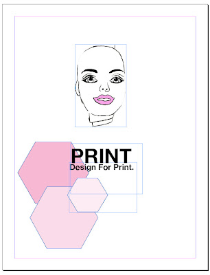
Todays workshop was really very useful, and taught me how to prepare images more for a commercial client using INDESIGN. For instance producing a book and sending it to a printers. Handing over the correctly saved files is terribly important and also making sure your settings/savings are all in the requirements that the 'printers' you use want.
This is the image i practiced with...


We firstly looked at colour and size from illustrator or photoshop too InDesign and how to save and correct files.
We also tested the Pantone refference chart... I picked Pantone 243...'''d.'s and the colour matched pretty well, but others found it was not the same at all.

Saturday, 10 October 2009

The Future in Traditional Design? BOOK REVIEW.

As part of this module we have to identify the effects that developments in our chosen area have had on us as visual communicators and society as a whole... this post is mainly directed around the book below, but also contributes to how it's effected me in the transition from 6th Form to University...


'Today's innovators in graphic image-making have grown up with the digital, with a computer in every classroom. For some, it's worth recognizing that even before school, digital kit in the bedroom, the playroom has been the real starting point of their creativity'.

This is a quote from a book extract i found on the net about the effects technology is having on society, but also the effects its now had being a designer. It only concentrates on digital art/illustration, but i find this really reflects how I have felt since I've been at university. When i first came to Uni I was a keen painter and used to only really produce images through traditional means... Since being in Leeds I have learnt how to use CS3 programmes and so now like to use them alot. It has seemed to be quite a natural transition from traditional to digital...


The artcile itself talk about greater access to constantly improving hardware and at ever-decreasing prices helping drive the purchasing demand from the public. Also as the quality of available hardware continues to rise, so does the software industry's output. Creative imaging and manipulation software has become far more powerful and easier to use, with manufacturers recognizing a new market growing quietly alongside the traditional market of creative professionals.

The explosion in the use and accessibility of both the Web and digital photography has also helped to fuel the rise in digital image-making. With the tools for manipulating digital photographs now readily available, many illustrators and designers have sought to increase their range of skills and move into areas closer to commercial digital illustration. For the home-user looking to find an audience for their work, publishing on the Web has been the logical progression: it avoids print, production, and postage costs which, in other media, can be frighteningly high.

It makes you wonder whether the internet is the key factor in why print and traditional means are starting to disappear? Learning programmes and anything you want a tutorial on, you can find on the internet, so many artists now have portfolios online as it's more accessible, more people will se your work. But does this not take away from the 'real' feel of/for the work and also the person it's come from?

Busy Weeks Of Exploring Ahead...


Blenheim Printroom Induction.


This was one of the better inductions i've had over the last year and a bit...
Finding out everything available was good for me, and also learning new techniques. Such as foils and flocks.
We began by all screen-printing an already prepared image on a screen, this taught me that lining up your image is always important. We did three spot colour seperation. This was useful practice as I'm going to screen print my wallpaper image tonight at Vernon Street and it needs to be in line and really in the right place for it to look good. The image below shows up close how it is sometimes hard to line the separate layers up perfectly but that it's very important for a well printed image.


We also looked at foils and flocking. This was really exciting, not originally knowing, I also realised that flocking is used on wallpapers more and more nowadays. Thus i have just ordered more wallpaper samples, including some flock designs. I've seen it many shops over the last couple of years. In fact the virgin media shop i have been visiting for my internet connection has it on their walls. Here is the flocking we did in the induction...

Here flock wallpaper is used in some sort of restaurant or shop... I would really like to try my wallpaper designs in flock.


Here are examples of a drawn image I screen printed a few months ago, but it shows the process of how the image develops really well. You can see the original photocopy which i then edited 2 of to get my colour separations. The next one is just the top black outline printed on chip paper which gives a nice effect. Then the bottom red layer which I printed first and then the two together which is the final image.


Send and Receive...'Work with your local community'...


THE
BIG
ISSUE

IN
THE
NORTH...

'The North is a business solution to a social problem'...It employs people to write, design and distribute a magazine that is sold by homeless people across the North of England.

It also had a tailored programme that goes with selling the magazine called The Big Life plan, which helps to support vendors achieve their goals and move away from the streets for good.
Vendors buy The Big Issue in the North from one of our regional offices for £1 and then sell it on established pitches in towns and cities across the North of England for £2. They keep the £1 they make on every magazine.

Selling The Big Issue in the North gives homeless people the opportunity to earn a legitimate income. It also gives homeless people motivation and self-esteem.

Big Issue in the North vendors are making a commitment to earn an income - 65% of vendors have never begged.

97% of vendors say they commit a lot less crime since they have been selling the magazine.


This is something my friend Amber is also interested in through the way that they allow people to help themselves, as an alternative to general charity work, and so we are both trying to get a place with the group.

We have got in touch with the nearest office which is in Leeds...sending an email to a woman named Patricia, with reasoning for wanting to work closely with them for a short amount of time and for any information or perhaps a short chat with her or someone involved within the group.

Here's our email..

Screen Printed Wallpaper Design...


Well... It sure was fun, and i think the images came out really well.. but i am starting to get really bored of this image. It was amazing how quick the process of Screen-print is once you have prepared your screen! Which makes it really attractive for if you had a commission of lots of one image and wanted to do it the most cost and time efficient way...That it really is.

For one print I screenprinted the outline of my barbie heads onto acetate, this means I can put pattern that i draw in the coming weeks behind the image and see what it looks like...


More images to come...
This is an image which I purposely didn't line up but it shows how the overlapping of colours or even the same colour can give a different shade. This could be used in a clever way?