Thursday, 11 March 2010

Interim Crit 1.

Today I had my tutorial with Matt Hodson, who used to be a student at Leeds College. In general it was about what I had planned for this project, but he also helped me in a big way in another one of my personal aims for this project, which is to understand and develop a rigid style and personality in/for my work.
I had just entered the Don't Panic poster competition and Matt then made me question who would see my work through this process and what I wanted to gain from entering my work into competitions - The Value of Don't Panic?' From this he suggested putting online portfolios together and possibly sending work to agencies, this panicked me a little, but is a really good way of getting my work seen! Especially as we've now entered this digital age of working.

From my worry of developing style in my work, Matt's told me draw draw draw! and begin forming a visual book of drawing, but also which I think is another important aspect of my work I want to put forward more strongly is to develop my own tone of voice through my work.
I also mentioned how I was frustrated by the way that I sometimes feel like I try to be and draw like other people, when really I just need to be myself. This is to be developed through my visual book and forming sentences/speaking and developing my own voice as a speaker through my work. A sentence I thought up that I feel reflects my thoughts is: 'Don't try to be: Just do.' Matt suggested always coming up with a slogan first and then put an image to it.

I also spoke about the idea of taking my laser cutting further with pattern as well, and likened the idea to Rob Ryans' Laser cuts and Matt's made me think about the idea of making it different in a lot of ways and produce something that people haven't pin-pointed yet!
I want to make myself draw lots of hand-drawn type, as I struggle with adding digital type to images.

He suggested some artists/designers for some inspiration:
Firstly Paul Davis...
Who works mostly through meanings and messages through sketchbooks.


Adrian Johnson...
Who doesn't really work how I like too but his messages portrayed through his work are excellent, clean/crisp images! All his work is client based and he's always working to a target audience. The website, seen below is also very very nice!


Lastly, Laura Carlin...
Has had many many clients, Laura primarly works in her sketchbook, both on location and at her studio. a prolific drawer and painter, she has learnt to appreciate mistakes and understand the power of white space. There is a book cover she has done which I love, a repeat pattern and then another image. I want to make sure I draw lots of pattern in my visual book.


Wednesday, 10 March 2010

Leeds - Henry Moore Institute.


Last friday Amber and I found ourselves at The Henry Moore Institute, Leeds, it is well-known for it's award-winning exhibitions, being a fantastic research centre and also a sculpture archive. In it's latest exhibition, the definition of sculpture has been adapted, in which Alan Johnstons' drawings give a new perspective on a familiar space. The exhibition, named, 'Drawing a Shadow: No Object', see's his drawings all over the walls of the Henry Moore institute and is placed in the main gallery.

It was interesting to see how this guy had been given a space to fill by the museum and then how he had interpreted the space. Without reading about the exhibition before you go, it is hard to recognise what the exhibtion actually is when you first walk in, you find yourself looking for work on the walls. It was not what I thought it would be, assuming it was drawings in the most literal sense. Where as, this exhibition displays and communicates the ideas of a structures shadow being formed against the walls of the gallery. The shadows are in fact the shadows of former buildings which stood before The Henry Moore Institute, so with the exhibition is formed a bit of historical knowledge.

It was good to see an exhibition that had been interpreted this way because It opened up my eyes to the idea of what an exhibition can be and that it's just as much about the space you are working in or putting work in as the work you are actually doing...It has been an eye opener also because as part of one of my briefs with The Big Issue In The North, Amber and I are putting on an exhibition at the end of it.

Online Portfolios.

As part of this brief I want to come to the end of it with a strong portfolio of work, and also get as many people as I can to see my work. Therefore I want to research into online portfolios and look into getting an account with as many as I see that I like and would suit my work.
So I've started looking and re-searching into finding good sites to use as a portfolio, but firstly I remembered one of which a friend showed me, which you are able to personalise a bit as well. It's called Krop:


Above is my friends photography portfolio and below is a friends illustration portfolio, i think it flatters both styles of work and looks fresh, tidy and clean cut which is what
When putting a portfolio together I think it is as much about you as an artist, as what your customer what want to see, to make them feel at ease and feel that you would be a loyal and trustworthy creative to hire.


Then as you can see below, when you scroll down you can select pieces of work and they are blown up to A5 size...


It's importantly used as a portfolio to find work as well, as you can attach a Creative CV/Resume to your portfolio page which people can look at whilst viewing your work. Of course for now I chose the free option, but there is an upgrade you can purchase, which gives you unlimited images, styling your gallery and video inputting systems. But I guess as an artist it's good to be selective with the work I will post, so this possibly works in my favour.
To view contact details of any artists you must be a registered company as well, so this in turn means if you are approached, you will be approached proffesionaly.

Another nice looking (blog) but looks a lot like a portfolio if you pick the right layout is on Tumblr! Here is again a friends tumblr account:


...and below by clicking an image enlarged and a caption or writing if desired.


One other website I came across, was a site called Cargo...

Client Brief with Big Issue In The North - STRETCH.

Talking to Claire in the Office at The Big Issue In The North, we have arranged a date to sit down and discuss what they really want us to produce or to happen, to engage with the vendors further. We have already spoken about the use of photography and possibly giving the vendors disposable cameras.
As it stands, Amber and I have a meeting to properly discuss it on the 26th March at 1pm. This gives a chance to concentrate on briefs we have now and then get a good start on it over easter also.

For now I've been looking into how I can re-search it a little and from having a tutorial with Nick, he mentioned that it would be good to get in touch with a woman called Carlotta Goulden who works for STRETCH - working in collaboration with museums and art galleries they create art events for specific groups, to help people access their cultural community and engage with society through creative arts.
They have apprantley done a homeless project, in which they produced a film form it. I have sent her an email asking her about it and seeing if she could possibly link me to the film they did or send it to me somehow.

She got back to me extremely quickly, and posted a couple of links that were films, based on a couple of homeless people in Leeds. This has helped in seeing how they dealt with such an emotive and sensitive subject. Obviously there are lots of issues surrounding this kind of brief, and stuff that Amber and I will have to seriously consider in doing it, as the people we working with in the client brief have specific circumstances. I think the idea we would ideally like to communicate is bringing the vendors and society closer together.

It will also be nice collaborating with someone throughout this brief, and working towards a finished piece/two different styles of work together.

Here's a screen shot of one of the videos Carlotta sent mee linked me too...Heres the website as well: http://www.myyorkshire.org/gallery.asp?type=1&journeyid=12


These videos have given me ideas of what sort of subjects you want to talk about with people in these circumstances. It's given me ideas and ways to approach it when we have a meeting with Claire from the office. I've emailed Carlotta thanking her very, very much! and also said I may contact her over the next few days with some questions or when we finally have the meeting with Claire, to ask questions about how they went about it?

Thursday, 4 March 2010

DP. POSTER .2. - TV

Seeing as the deadline date was ridiculously close to starting this project, my poster didn't really get a fair chance in the voting system. It says to make sure you get your poster done early so as to get the full time to get votes, although I thought that my wallpapers were good to enter for the theme and so looking at it overall, it gave my work some sort of recognition, some people will have seen it I guess! It served some sort of purpose and got me stuck in quickly.


THEME: 'TV'

DEADLINE FOR VOTES: 28/03/10
VOTING BEGINS: 15/03/10

This month it's being judged by Rob Brearly of design studio Golden. At one point he did actually work in Leeds and Thompson Design Partners. I've looked into what kind of work he produces through his website http://www.rgbstudio.co.uk/ as this in turn will lead to what poster he decides to chose. He works in the graphic design sector and does lots of campaign work plus promotional material, and has just become GOLDEN.


I've begun thinking about the poster, which i probably should have done earlier, as it's important not to look at the 'deadline for votes' as the actual deadline, if my posters to actually have any success. Here's an initial brainstorm of my ideas regarding TV:


But here is an amazing bit of film/animation which paul sent to me in regards my crit studies subject. 'What Idea of femininity does Barbie Signify?' Which also ties in well with my animation I did for the fmp in year 1. Im so in love with this film piece. Although, through watching it I think it's what I want to base my next illustration/image on for the this Don't Panic Poster. I think that as a theme for my poster it will mean I'm able to create a good piece of work which I really believe in, as It's a subject I am very passionate about.


From watching this video and from re-search I have done for previous projects I have now created another brainstorm of ideas for an image around this subject/theme.
I still haven't decided what medium I want to create the poster in, as in through drawing or laser cut or paint. Although as I was saying in my post about the first poster I submitted I don't think that anything screenprinted or laser cut will come through and be seen as well as it should be, which means I will probably almost definitely submit something digital and drawn for this brief, but then to adapt it in ways, possibly laser cut it and layer them up.


Wednesday, 3 March 2010

3rd Draft.

On my way home I popped into the art market and went to 3rd Draft. The 4th in a series of one night illustration showcases, curated by Nous Vous in collaboration with theartmarket. It is an open and free exhibition, which makes it even more worth while going along! It's a good oppurtunity to pick up some, unique and affordable, artists books and fanzines. A particular favourite is
Cafe royal which is co-ordinated by Craig Atkinson, a illustrator that I really admire. I found some of his books on the shelves, they were reflective of what I would like to produce to get my work seen.


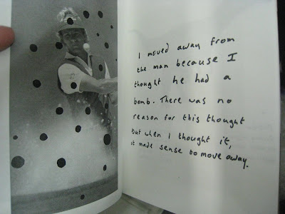
There was also another artist that I really liked, I liked the idea of the little running commentary and photo that has been adapted ever so slightly. This is something I need to develop more in my work, such as writing thoughts and how I view the world as a designer, and things that I SEE. This in turn will stylise my work and make it mine, which is something I wanted to define throughout this project.

Tuesday, 2 March 2010

Big Issue In The North Magazine.

This is a scan from this weeks The Big Issue In The North, which features an article about The Outreach program at The North office and what Amber and I do with the team and with the vendors. It was a really nice article and has gone to 'marketing' at college.