Wednesday 18 February 2009

i am cat.

These are a couple of compositions i scanned in from an A3 bit of card that me and my boyfriend had some fun with on a boring wednesday evening. I really like the use of collage and all the different ways of drawing within them. Plus it was good fun!


Thursday 12 February 2009

EVALUATION.


Researching, exploring and documenting my relationship with communication technology has given me a massive insight into, not only, the definition of what communication technologies are and how diverse they are. But also, its opened up many new options for me that I didn't feel I had towards the beginning of my visual journey in September. The sheer number of ways to communicate through technology, has shown me what creative opportunities and limitations some of these technologies hold and given me time to think about what technologies are better suited to what types of media, for example concentrating on illustration for my own little project, taught me that illustration could be formatted and finalized in so many different ways. These include, t-shirt and clothing illustration design, posters, advertisements, websites, animation and even live art in bars or cafes. I also learnt a lot about the social networking sites, of which there are so many and that I used to just take for granted, not think about how and where they come from. Plus, gaining an interest for all the online portfolios and blogging sites that are around today. What was key in this processes, was that I chose to display my work in a sketchbook and also by having my own blog and posting every other day, my discovery, interests and of course progress on my own project.

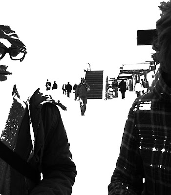
Within this project we selected and tested, interactivity, narrative and communication - some key design processes. To test interactivity and communication, we looked into 'gaming' and the varying online games. The games we invented and set for other groups were to be played in Bradford. The city becomes a metaphor for shared space- for exchange and communication. The games we created, developed and tested ourselves followed either a psychogeography theme, role play theme, time based, transport networked games, signs and symbols or geo-caching. The task set would be either a set route or devised by the group at the time of the walk. It was for the group to 'get to know' Bradford, (make people explore) and each group were to take photographs in some strategic way to the task. The task that I received in my group was to take pictures on a devised route of everything that was red. This then led to geo-tagging the places that I found the photos I took.

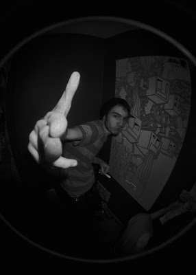
Exploring narrative showed me the way to getting to know the technology of bluetooth much better and appreciating the capabilities of the mobile phone, even if the pictures we ended up with weren't of the best quality. Using mobile phones and comparing them to others photos in the group brought up the question of the development of the mobile phone and gave me a greater realisation that if you look around you, practically everybody around you has one. Could this be the greatest ever sold, worldwide item in society today? Not only the technology, but the actual task of taking photos on our phones to communicate the narrative we had created through 'Chinese whispers' was interesting especially being interested in illustration because it made me realise how many different ways messages and images can be communicated to an audience and also interpreted by hat audience.

I learnt a lot from actually having to re-do the task, it made me more aware that your first thoughts of something could always be better if you ponder and think of everything possible rather than jumping at the first idea you have. I believe this is particularly important in deciding on a project, which I do usually have a lot of trouble doing, so this has given me a better insight into decision making.

For my project, I chose to base my project on, photography, illustration and printing, concentrating mainly on illustration and how through time, the world has become much more digitalised, using graphics tablets, and programmes such as photoshop and illustrator to put together images, even questioning if paper will be around in ten years? This interested me solely due to the fact that I think this is where I would like to be and what I would to be doing in the years to come and through researching this particular subject I could gain a better insight into the profession i'm wanting to put myself into. How will illustration be excepted in 10 years? I found an interesting article about the 19 year old guy who worked in a card factory for a year after being freelance for two years and this leap into the real world for a year really made him question what illustration was becoming. A repeatative market where what sells will be produced? I also now want to look more into how illustration in advertising can be used to trick and portray hidden messages as I always thought this was only true through typography. I believe there is a really strong relationship between my chosen technologies, as most illustration artists that I researched during this project had all gone on to from animations and had their own photography. Animation seems like the next step to bringing your illustrations to life and printing is always important within illustration, as there are just so many ways to format your final piece.

When discussing tasks we had done and in crit sessions about our own projects it really helped me when we were in smaller groups and also not 'friend' groups as it was nice to get a fresher out look on my current point and findings from people that didn't know me as well. Feedback that I received from peers and tutors was useful and it helped me to realise that history is just as important as the present and it can sometimes lead you to a better result. It also felt useful to use communication technology as a research tool as well as a subject of exploration as it felt as though through using a blog I was actually testing the use and ease of technology all the time.

I think that i've successfully communicated my process and research, through my blog, I managed to put everything in a good order and made it easy to establish through each of the headings, however this is something which is good about blogspot. Although the set out of the way you type and insert images I think could maybe be improved a little, for non computer literate people. I may get a flicker account as from looking at others' blogs they look quite swish and watching friends, they seem to get around them easy.

and finally that everything I have learnt and experimented with throughout 'the sandpit' has really made me appreciate the time and dedication that goes into all the work i've seen, especially animation. For every animation I see now, I feel in debt to the aritst for watching it! Not only this but, this whole project has just made me see communication as not just something obvious like a telephone or web device, but also more and more through my own work, and everything I ever produce. Its made me want to find out and more and keep myself updated monthly about what is really going on in todays society to do with technology and where technology is being taken... considering that in the 90's they thought that we wouldn't have paper anymore in 2000, what will it be like in 10 years time?


A semi-final piece?

This is the final montage, put together with drawings i've done form the various photos i've taken over the last couple of weeks for this project. Although, it was too big to fit in the A3 scanner so i had to scan it in three bits...


This piece is not really a finished image, i guess its just a summary of what i've found and learnt from the cameras throughout this project. Below are some bits of it i like and think form good compositions.. possibly for print?... What i would do next:
Think about different ways to print it... and in what format it will be in. How and where will i display it? Could i just take pictures of it with all the different cameras i used originally to compare this futher before printing it?


LAYOUT.

Darjas' Work. I came across this site which i think is a site by a company calling theselves Red Beast...www.redbeast.org, showing their many different presentations of layout which they have had to do for clients. All the different ways in which this work is presented show you ow many different ways you can finalize and format your work and put yourself forward as a designer.

Below is a website, the client being Red Beast concept, Norway.
Digital web design, 2D animation, all graphic elements.


Firstly is an illustration. Euro themaic. There client was - NK Verslas (business magazine) in Lithuania, using print and illustration.
On the right is a book, called 'You are in Russia' - which was one of their own projects.
This incorperated print, book layout, illustration and text.


Below, a poster promoting Vilnius. Clint - Vilnius City Municipal Government Economic Department Tourism division. Print and Graphic Design.


Here is a corporate style grid for a design magazine. Client - 'Centras' mag. Luthuania.
Together with, prin. Corporate style, Grid rules an layout, advertising.


Here are different print materials. Web attributes. The client was Red Beast Design, Red Beast Concept. This shows the range in which illustration can be finalized.


Lastly, here is a DVD presentation for the research on Norwegian customer types in supermarkets. Customer segmentation. The client was Sylinder Kunderutvikling.
It is Digital, Film and TV. Draja's part: concept and visual communication - illustration, layout and photography of products... 


Tuesday 10 February 2009

PRINT.

Another way of illustrative work being formatted in the end...
This is a magazine called PRINT.

http://www.pressandplay.com/blog/print-cover.png

January/February—Talks about Design Under Pressure
'The world is always presenting opportunities for urgent communication. Wherever there is an urgent need to convey information, there are designers, professional and self-taught, responding to the call to inform and spur people to action. How can designers around the world connect and teach people, and how can they do it most effectively? From newly repainted murals in Northern Ireland, to landmine warning signs, to activists' customized Google Maps, to a collection of rarely seen and
gorgeously handcrafted artist's books in Cuba, Print looks at a world of design for a turbulent and hopeful globe'.

Concentrating on layout, here is a layout for Print Magazine, describing a week of consumption through metrics including food, drink, utilities, media and more. 'The Obsessives'... The colours are vibrant and the layout, with the white neutralising the blue makes it look really flush.

Take a look and see...

Below are some images done by a guy named Josh Cochran. From concentrating on 'people' for my own drawings for this project, i found these really interesting and think they look awesome. Mainly the subtle blacks and greys, but i love how this really exaggerates the ONE bright colour. I try to, but i would like to do this more in my work. As he does short animations as well, i guess this is someone who works in a similar style to me.
Check it out: 


Monday 9 February 2009

Illustrator.

Before i created the following pieces from my drawings, i had never really tried using the program. Although these images arent really me, i did enjoy creating them, and almost a new style for me to work in sometimes perhaps?
I would live trace the images, manipulating the drawing i had done and turning them into an altogether different piece of work. From working with illustrator, you begin to understand that it tends to flatten images and what is fun is that it turns the whole image into their own little shapes.
The first two that i did below i think worked well as i used a strong photo, (they are from the lomography photos). It is so easy to change the colour of certain parts as well, and as long as you dont save your image as a jpeg then for work being commisioned or if someone likes something but they want it in a different colour, its easy to change the background or little bits. The first one was just blue and then i changed and selected different bits to be different colours.


This was Another lomography picture, the one with the stairs. I found this image much harder. As i said above, because this wasnt a strong photo i found it hard to make something out of it. Therefore i started with a shape, the triangle. Being so easy to duplicate and change the colour i played around with it and eventually came up with something i though was interesting. What was amazing about using illustrator was that it has swatches, they are all colours that are already picked for you, a couple of favourite swatches of mine are 'Russian Poster Art' and 'Textiles', the one below is using 'Basic Graphic Dots'. Below that is the first one i did, just using simple contrasting colours, also using the 'reflection' text technique which you can also apply.


Photoshop.

Before doing this project, photoshop was always the first place i would go with a photo to edit to then draw from. After gathering all my photos from the cameras, i decided to edit some of them so they were easier to draw from and didnt look so like a photograph, however i dont think many of my images did look like the photos. This is due to the technologies!
Here are a couple of the images I adapted in photoshop...
...


Plus, another technology commonly used by new illustrators is the Graphics Tablet...


Monday 2 February 2009

Drawings From Photos...

A few drawings from the photos on all three cameras. Producing the pictures in my own style, kind of takes away from the photographic nature of these images. However i've tried to keep the detail in a couple...
All of these images could be printed in so many differnet ways, thanks to the many technologies founded. Such as...lino, mono, collograph, screen and etching. Plus you can screen print, stencil, lino and digitally print onto fabrics.
Since i have not had time to go and experiment/try out the many different types of print with my images, i went to the print making people and asked them a series of questions to gain an insight of finalising work.
As a start to a final piece for this brief, im going to produce an ... size montage of illustration from all of the photos i have used.


Ways to Illustrate...

Within the broad definition of 'Illustration' nowadays, (which i think is partly due to the ever changing technologies available to use), ways in which we draw to create an illustration and even programmes we use to finish and refine work, have a major impact on a piece of works final outcome. Will the pencil eventually be put out of a job. Are we someday in the far far distant future, all going to work on computers and graphics tablets to draw! As will, books dissapear?!
From the drawings and images i developed i put a couple into photoshop and illustrator, i also used stitch as a way to draw (thinking of sewing machines as a technology) and a graphics tablet. I used all of these as an insight to new technonlogy.

Fabric illustrations are not new, using embroidery to depict images is not new, so how come it's suddenly so cool? Pick up a style magazine; Dazed & Confused, The Face, I-D, even Vogue and there is every chance you will find an embroidered illustration inside.
I looked into sewing illustration and these are a couple of my favourites...

The image below is Sacha Spencer Trace, stylist Stacey Williams, embroidery designer Debbie Stack: Acid. Sacha also joint founded the magazine Marmalade, full of the creative industries, media, style, fashion and contemporary culture.

http://embroidery.embroiderersguild.com/2003-6/imgs/rudgley1.jpg

There is also Sarah Crawford...This is The Face, August 2001. A stitched and digitalized face.

Denim

SLR Digital. Drawing with Lights!

Here are some photos from my induction in the photography lighting studios, with the SRL cameras. From this afternoon, i learnt a lot about the technicalities of the camera and how to use it properly manually. We went about the college taking photos, but also had some fun creating light graffiti. Setting the camera up on a tripod, we then set the camera to a very slow shutter speed - (30 second exposure), and closed off all the light to the studio. Here are a few of the images we came up with...
We tried putting sheets of acetate in front of the lens to alter the colour. however it didn't work as well. Some of the best images were the ones we did first, and we tried to make images that simply didn't work. It looks easy but there is deffinetly a skill to it.